Sepia Toning with The GIMP
| Before | After |
|---|---|
 |
 |
In this tutorial I’ll show you how to sepia tone a color or black and white image. This technique is modeled on the traditional darkroom method of sepia toning in that the sepia color is applied “unevenly” to areas of different tonality. It works much better than most of the simple methods I’ve seen for image editors and provides great control!
The basic technique is to create a “Sepia Tone” that will apply a sepia color layer according to a layer mask that is based on the tonality of the image.
Giving credit where credit is due: I did not come up with this method. I adapted it for The GIMP from a Photoshop tutorial on the RetouchPRO web site.
The Procedure
| Here is the original image, loaded into the GIMP. It has a bit of an old-time look, so I thought it might work well as a sepia-toned image. |  |
||||
| You can compare the result we will get below to the GIMP’s built-in script-fu for sepia toning (Script-Fu/Decor/Old Photo) as shown at right.Come back and compare to this when you get to the end of the tutorial. |
|
||||
| Duplicate the original image (Image/Duplicate or Ctrl+D). You may want to minimize the original now (or close it) so you don’t choose it by mistake.Using whatever technique you like best, convert the duplicate to B&W. I recommend the channel mixer for best results, but you can also convert to grayscale (Image/Mode/Grayscale) or desaturate (Image/Colors/Desaturate).
Whatever technique you use, convert the B&W image back into RGB mode when you’re done (Image/Mode/RGB). In this case I simply did a mode change to grayscale, then back to RGB mode. |
 |
||||
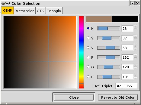
| Double-click on the foreground color swatch to bring up the Color Selection dialog. Dial in the color RED=162, GREEN=128 and BLUE=101 (you can experiment with this color to get different tones; this is a good starting point though.)RED=162, GREEN=138 and BLUE=101 also gives good results (slightly lighter and more traditional sepia) |
|
||||
| Bring up the Layers dialog (Ctrl+L) and click on the button for a new layer. Give it the name “Sepia Tone” and choose the option to fill it with the foreground color. Click OK.You should see nothing but the color now in the image window, since it obscures the image in the layer below. Now change the Mode (blending mode) of the layer to “Color”. This applies the color from the Sepia Tone layer according to the layer mask to the image.
If you like the strong sepia cast of the image you can stop here. |
|
||||
| In the traditional sepia toning process, the tinting occurs most in the mid-tones: the lighter and darker areas appear to be closer to B&W. We can mimic this behavior with a layer mask. The lighter a pixel is in the layer mask, the more opaque the corresponding pixel is in the upper layer; the more opaque it is, the stronger its effect will be in blending with a pixel in the layer below. The trick to getting the desired effect is to make our layer mask be an “half inverted” copy of the background image. Read on, and you’ll see what I mean in a bit.Right-click on the Sepia Tone layer and select Add Layer Mask. In the Add Mask Options dialog, choose White (Full Opacity).
In the Layers dialog, click on (select) the Background layer. Go up to the image window, select all and copy (Ctrl+A then Ctrl+C). In the Layers dialog, click on the layer mask icon in the Sepia Tone layer (the little white square). Then go back up to the image window and paste (Ctrl+V) In the Layers dialog, click the Anchor button to anchor the pasted image into the layer mask. |
|
||||
| With the layer mask still selected (it should be, if you just pasted into it), bring up the Curves dialog by right-clicking in the image window and selecting Image/Colors/Curves. Click to add a control point in the middle of the linear graph. Then grab the right (upper) endpoint and drag it down to the lower right bottom as shown at right. What you are doing is “half-inverting” the layer mask: making all highlights into shadows so that the midtones are the brightest part of the image. When you’re all done click OK; you should see a subtle difference in the way the tinting shows up in the shadows and highlights and overall the toning effect is more pleasantly subdued.To more clearly see the effect of the layer mask, hold the Control key and click on the layer mask icon in the Layers dialog: a little red outline should display around the icon and the image window will change to show the blend without the effect of the layer mask. Control-click the icon again to toggle the effect of the mask back on.
If you want to do further image editing on the image it might be a good idea to save your work under a new name at this point, or duplicate the image (Ctrl+D) and flatten it (RC/Layers/Flatten Image). If the GIMP had adjustment layers, we’d just create one of those to continue with further enhancements, but lacking that it’s a good idea to give yourself a “checkpointed” result that you can start over with if further edits go awry. You can experiment with changing the hue and saturation, punch up the contrast with levels and curves, or do any other necessary edits at this point on the flattened version. |
|
||||
Once you’ve got the base image, you can duplicate it (Ctrl+D), flatten the duplicate (Layers/Flatten Image) and then experiment with:
You can always compare the result to the base image. If you want to start over, just duplicate the base image again and off you go.Here I decided that the image was a little flat and so I punched up the contrast using curves. As a final touch, I ran the “Old Photo” Script-Fu without the “sepia” and “mottle” options. You could also try adding film grain to make the image look old. Here is the final image. |
|


Tips and Tweaks
- You can reduce the effect of the sepia toning by adjusting the opacity of the Sepia Tone layer.
- Try adding some grain or noise to the image (probably before you desaturate).
- We used a single, flat color for the sepia color. Experiment with different colors, multiple colors or a color gradient for the Sepia Tone layer.Another example of this same image toned with a different color.
- You can apply levels, curves or other adjustments to the contrast mask to increase or decrease “absorbency” of the sepia color into different areas of the image.See this addendum for some experiments I did varying the layer mask to see its effect.
- The method by which you get a black and white image makes a big difference in how the sepia toning comes out. Witness:


The one on the left was from a grayscale conversion (Image/Mode/Grayscale); the one on the right started as a desaturate (Image/Colors/Desaturate; both are shown prior to a final contrast enhance with curves). Notice that there is a lot more blue-channel noise in the right-hand one. This can add a nice “grain” effect (see tip above also) if that is what you are looking for. For this particular image, I prefer the smoother tonality and darker contrast of the left-hand image.
- Try combining this technique with simulated film grain or other techniques on this site.


Further Reading on Sepia Toning
- Doing this same process with Photoshop ( Part I, Part II)
- Stepwise Sepia Toning Using Adobe Photoshop. This method, using Duotones and Tritones, seems to be quite popular.
- Here’s a great way to mimic a particular toning that you like and apply it to other images: from Photoshop for Photographers: click “Black and White” in the left column, then click “Copy a Tone”.They also have a nice selection of “classic” tones (click on “Classic Tones”).
- Blend modes: How do Adobe Photoshop, Micrografx PicturePublisher and Pegtop XFader blend layers? (great reference)
- Duotones in Photoshop, from the Luminous Landscape.


[…] Momohime and decided to try to produce an old-fashioned sepia-toned image for kicks. I started with this tutorial (for GIMP) and found that I actually liked the results of blending the sepia and the original color […]
Pingback by Wallpaper: Alter 1/8 Momohime « Figyura (フィギュラ) — October 31, 2010 @ 5:10 pm